Dark Mode lets users change the theme color of the website/mobile apps to black or a shade closer to black. Material-UI provides a customizable Dark Mode theme where you can customize your background color according to your need.
Syntax:
import { ThemeProvider, createTheme } from '@mui/material/styles';
import CssBaseline from '@mui/material/CssBaseline';

const darkTheme = createTheme({
  palette: {
    mode: 'dark',
  },
});

function App() {
  return (
    <ThemeProvider theme={darkTheme}>
      <CssBaseline />
      <h1> Dark Mode</h1>
    </ThemeProvider>
  );
}
export default App;
Installing React App::
- Step1: Create a React app using the following command.
npx create-react-app dark-mode-react- Step2: Now move into the project directory
cd dark-mode-reactInstalling Material-UI: To install Material-UI in your project run the command below using npm:
npm install @mui/material @emotion/react @emotion/styledor using yarn:
yarn add @mui/material @emotion/react @emotion/styledNow we need some content on our webpage to see the dark mode effect so, let’s first add some stuff.
Step1: Create new file AppBar.js in the src folder of your project and import the basic App bar components from the Material Ui website.
//AppBar.js
import * as React from 'react';
import AppBar from '@mui/material/AppBar';
import Box from '@mui/material/Box';
import Toolbar from '@mui/material/Toolbar';
import Typography from '@mui/material/Typography';
import Button from '@mui/material/Button';
export default function ButtonAppBar() {
return (
<Box sx={{ flexGrow: 1 }}>
<AppBar position="static">
<Toolbar>
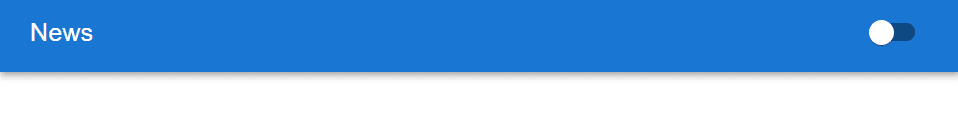
<Typography variant="h6" component="div" sx={{ flexGrow: 1 }}>
News
</Typography>
<Button color="inherit">Login</Button>
</Toolbar>
</AppBar>
</Box>
);
}
Example:
Step2: Import AppBar.js in the App.js file and then run the app.
import * as React from "react";
import ButtonAppBar from "./AppBar";
function App() {
  return (
      <div className="App">
        <ButtonAppBar/>
      </div>
  );
}
export default App;
Output:
- Change the title from news to welcome to GFG in App.js and update it.
Step3: Now it’s time to create a switch that toggles from light to dark and dark to light.
Update the AppBar.js by replacing the button components to switch components which requires two imports.
import Switch from '@mui/material/Switch';
const label = { inputProps: { 'aria-label': 'Switch demo' } };
//<Button color="inherit">Login</Button>
<Switch {...label}/>Here, we make a card to add to our webpage, it makes a pretty cool webpage and looks like a website.
- Create a Card.js file in the src folder and update it.
Example:
//Card.js

import * as React from 'react';
import Card from '@mui/material/Card';
import CardActions from '@mui/material/CardActions';
import CardContent from '@mui/material/CardContent';
import CardMedia from '@mui/material/CardMedia';
import Button from '@mui/material/Button';
import Typography from '@mui/material/Typography';
import img from 'https://media.geeksforgeeks.org/wp-content/uploads/20220930110109/download-200x200.png'
export default function MediaCard() {
  return (
    <Card sx={{ maxWidth: 500, marginTop:5, marginLeft:70 }}>
      <CardMedia
        component="img"
        height="140"
        image={img}
        alt="green iguana"
      />
      <CardContent>
        <Typography gutterBottom variant="h5" component="div">
          Lizard
        </Typography>
        <Typography variant="body2" color="text.secondary">
          Lizards are a widespread group of squamate reptiles, with over 6,000
          species, ranging across all continents except Antarctica
        </Typography>
      </CardContent>
      <CardActions>
        <Button size="small">Share</Button>
        <Button size="small">Learn More</Button>
      </CardActions>
    </Card>
  );
}- Now, import it into our App.js file.

Step4: Now, we have to make some changes in our App.js file. First of all, we have to make some imports.
import { ThemeProvider, createTheme } from "@mui/material/styles";
import CssBaseline from "@mui/material/CssBaseline";
import { useState } from "react";
- Import is done now, make a one-useState hook with an initial value false that changes the state from light to dark, and also create palette color with the help of createTheme like this.
const [darkMode, setDarkMode] = useState(false)
  const darkTheme = createTheme({
    palette: {
      mode: darkMode?"dark":"light",
    },
});- Here, we have to wrap JSX with ThemeProvider and pass darkMode useState variable as the props to ButtonAppBar components and make the setDarkMode function opposite to the initial value because every time we click to switch it makes the opposite of previous theme like if there is a light theme it makes dark and if the theme is dark by clicking the switch the theme becomes light.
//App.js

import "./App.css";
import { useState } from "react";
import ButtonAppBar from "./AppBar";
import * as React from "react";
import MediaCard from "./Card";
import { ThemeProvider, createTheme } from "@mui/material/styles";
import CssBaseline from "@mui/material/CssBaseline";


function App() {

  const [darkMode, setDarkMode] = useState(true)
  const darkTheme = createTheme({
    palette: {
      mode: darkMode?"dark":"light",
    },
  });
  return (
    <ThemeProvider theme={darkTheme}>
      <CssBaseline />
      <div className="App">
        <ButtonAppBar check={darkMode} change={()=>setDarkMode(!darkMode)}/>
        <h1>Dark Mode</h1>
        <MediaCard />
      </div>
    </ThemeProvider>
  );
}

export default App;
Step5: It’s time to update AppBar.js firstly we have to get props like checked and change from App.js and pass them to the Switch components.
- The change prop is passed to the onChange event handler and checked is also passed in the Switch component which is the initial value of darkMode.
- The updated code of AppBar.js is below:
//AppBar.js


import * as React from 'react';
import AppBar from '@mui/material/AppBar';
import Box from '@mui/material/Box';
import Toolbar from '@mui/material/Toolbar';
import Typography from '@mui/material/Typography';
import Switch from '@mui/material/Switch';
const label = { inputProps: { 'aria-label': 'Switch demo' } };


export default function ButtonAppBar({checked, change}) {
  return (
    <Box sx={{ flexGrow: 1 }}>
      <AppBar position="static">
        <Toolbar>
          <Typography variant="h6" component="div" sx={{ flexGrow: 1 }}>
            Welcome to GFG
          </Typography>
          <Switch {...label} defaultChecked color="default"  onChange={change} checked={checked} />
        </Toolbar>
      </AppBar>
    </Box>
  );
}
Step6: Now, it’s all done, Let’s run the command to start React server
npm run startYou can open the app link and enjoy the dark theme on your website by clicking on the toggle button to switch between light and dark themes.
Output:

